Non-Hodgkin's Lymphoma video illustrations
Illustration

The Brief
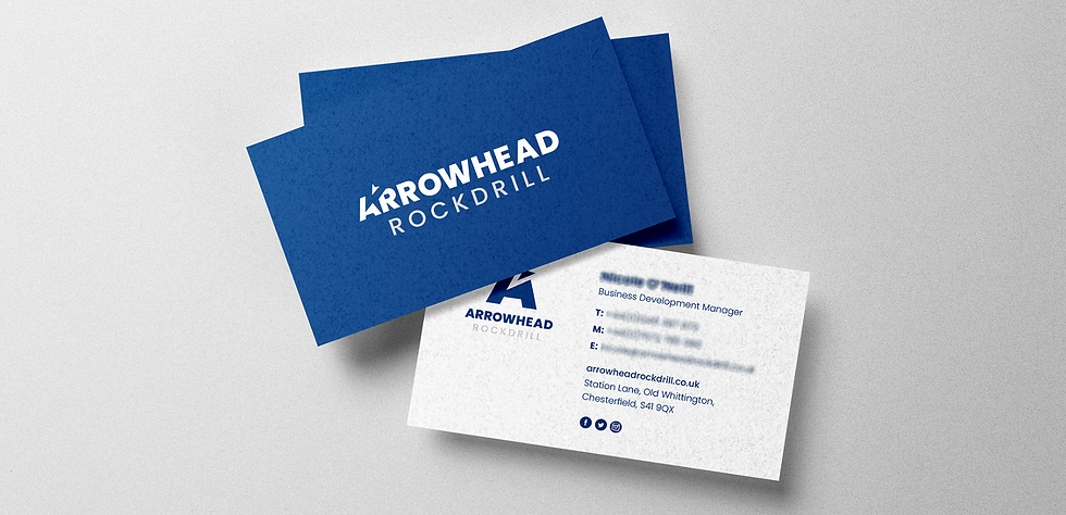
Arrowhead Rockdrill, an established hydraulic equipment supplier with an international customer base, sought a brand refresh to modernize their identity while maintaining familiarity for existing clients and subsidiaries. Their previous logo had become outdated and needed a more professional, versatile design that worked seamlessly across both digital and print applications.


The Approach
To ensure continuity with the existing brand, I retained key visual elements—the arrowhead graphic, the signature blue colour, and a strong typeface—while refining them to create a modern, impactful identity.


The Outcome
The refreshed Arrowhead Rockdrill brand presents a strong, modern identity that maintains recognition among long-standing clients while elevating its professional image. With clear brand guidelines and versatile marketing materials, the company can now apply its new look consistently across all digital and print channels, reinforcing its position in the global market.
_gif.gif)