Manor Farm Park & Woodlands events
Event concepts / logos, Marketing Materials

The Brief
Manor Farm Park & Woodlands is a family attraction where parents bring children up to the age of 12 to enjoy animal encounters, outdoor play areas, and indoor activities. To boost visitor numbers, especially during school holidays, the farm runs themed events throughout the year.
The challenge was to create event identities and marketing materials that:
-
Appealed to children while still feeling trustworthy and professional to parents
-
Reflected the theme of each seasonal event
-
Promoted the farm as a fun and safe family day out
The deliverables included poster and flyer designs, as well as concepts adaptable for social media and website content.


The Approach
To give each event its own personality while keeping the overall brand consistent, I created a set of individual visual identities inspired by each theme.
-
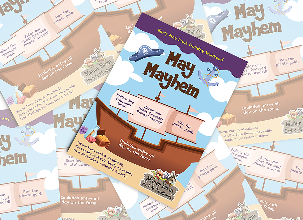
Child-friendly design: Bright, playful visuals and illustrations were tailored to appeal to children up to 12.
-
Parent reassurance: Balanced the fun style with clear, professional layouts that reassured parents the events were safe, organised, and family-oriented.
-
Templates for consistency: Established a recognisable poster/flyer format with bold top and bottom borders and a central area highlighting three key activities. This allowed each event to stand out while maintaining a consistent brand style across the year.


The Outcome
The project resulted in:
-
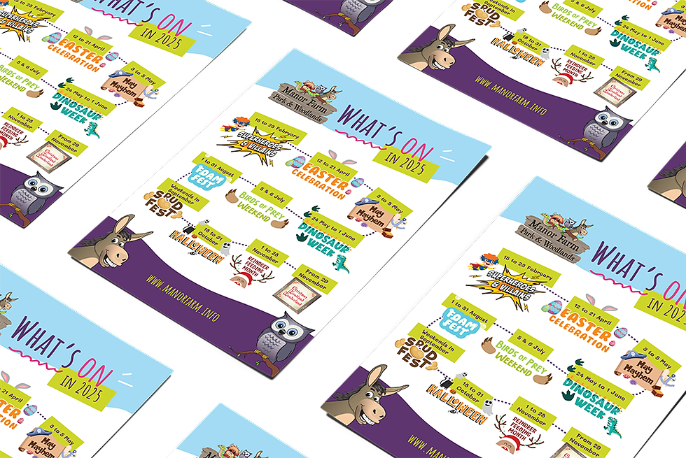
10 themed event identities, each with a unique but cohesive look and feel
-
Marketing concepts ready for posters, social media campaigns, and website content
-
A strong set of designs that could be reused and adapted for future events, ensuring the farm’s marketing remains consistent, engaging, and professional year-round
The refreshed event branding helped position Manor Farm Park & Woodlands as a fun, family-friendly day out, while giving parents the confidence to choose the farm as a trusted destination for school holiday activities.
Brogan is an absolute pleasure to work with. She’s a talented designer who really takes the time to understand the brief and consistently delivers work that hits the mark.
Sarah Howitt
Marketing Lead, Manor Farm Park & Woodlands


