Ananda Spa & Beauty branding
Logo, Brand Guidelines

The Brief
Ananda is a new spa and wellness retreat in Nottinghamshire, designed as a peaceful escape from daily stress. Inspired by Hindu philosophy, Ananda means bliss or happiness, a feeling the brand needed to embody.
With competition from Aqua Sana in Sherwood Forest, Ananda needed a unique identity rooted in calm, relaxation, and connection. They loved lotus flowers, diya lamps, and wanted gold accents for a touch of luxury.


The Approach
To bring the brand to life, I focused on earthy, natural colours—grounding the identity in the beauty of nature while reinforcing the spa’s spiritual ethos. Deep gold was used as an accent colour, adding a rich, luxurious feel without overpowering the sense of tranquillity.
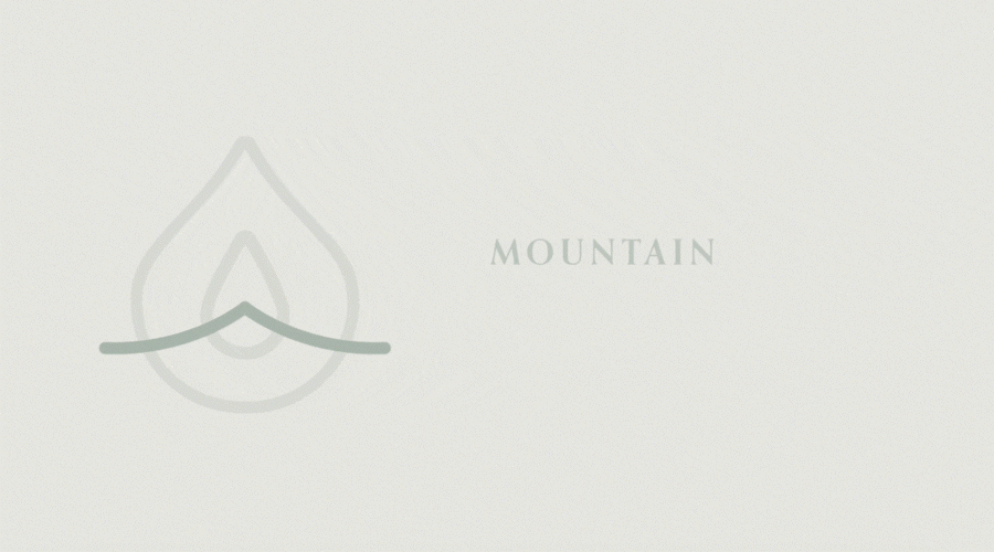
The typography needed to be timeless and elegant, so I chose a classic serif font that speaks to the spa’s sophisticated demographic. The logomark itself is a fusion of spiritual symbols: the diya lamp’s teardrop shape, the flame (or lotus petal), and a soaring mountain—representing the soul’s journey to peace and enlightenment.


The Outcome
The final brand is a seamless blend of serenity and sophistication, perfectly suited for both the spa’s physical space and its marketing materials. Ananda now has a visual identity that speaks directly to its audience, creating an inviting and tranquil escape from everyday life.


